ShopDreamUp AI ArtDreamUp

Deviation Actions


Description
A birthday gift for 10th March team! 


and early gift for
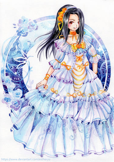
Here is my really old OC (one of firsts) Aquarius [link] (omg, did I really draw like this 3 years ago?!) restyled. I drew this on A3 format. Yeah I was bored xD
Anyway, Happy Birthday everyone, and Thank You for all wishes!
My tumblr: [link]


and early gift for
Here is my really old OC (one of firsts) Aquarius [link] (omg, did I really draw like this 3 years ago?!) restyled. I drew this on A3 format. Yeah I was bored xD
Anyway, Happy Birthday everyone, and Thank You for all wishes!
My tumblr: [link]
COMMISSIONS : [link]
You might like:
Image size
3500x4888px 12.58 MB
Make
HP
Model
HP pstc4400
Date Taken
Mar 10, 2012, 1:10:28 PM
© 2012 - 2024 Ikanu96
Comments146
Join the community to add your comment. Already a deviant? Log In
It was nice that the artist did show us a piece of artwork from three years ago and today as you can tell how much they have improved. It seems to be based on the fanfiction Sailor Zodiac characters based on Sailor Moon.
The piece is very well drawn and colour and as a scan it is very hard to tell that it is coloured in pencil. With only the mirrors being the only obvious part of the picture that you can see the coloured pencil. The detail of the piece is fantastic, it must have taken a long time to draw with pen and pencils. Shading and that well is very hard to do, although you may see pictures like this drawn with Digital medium, it is a lot easier to colour and do effects, with traditional art it is much harder to correct mistakes or to change something.
The only critisms I do have is that the arms and hands do seem rather small compared to the head, although it is being picky. The white space in the bottom left hand corner does seem to be a little overpowering compared to the rest of the picture, it does feel like it should be a different shade (although I can see that it does off being a different shade, so it may be the scan of the picture) or covered with flowers or ribbons just to mute it a little.
One problem with drawing bishojou characters is trying to make them different so it does not feel like you have seen a similar picture before, although the artwork is fantastic it does feel you are looking through an art book of Sailor Moon or similar series.
The love and commitment in their work does shine through. Personally I do find it hard to believe that the artist has improved very much over the last three years and that they are 16 (just). I think if the artist keeps drawing and does improve then they do have a bright future ahead of them.